

Ode to an Icon | Publication Design
Project Insights
Over the last decade, typography has certainly changed with the way society consumes information. With the invention of the computer and the implementation of the world wide web, access to information has influenced the creation of new ways to view typeface. Typeface has been remodeled and perfected for simplicity and readability digitally, with the way it presents on screens being the top priority.
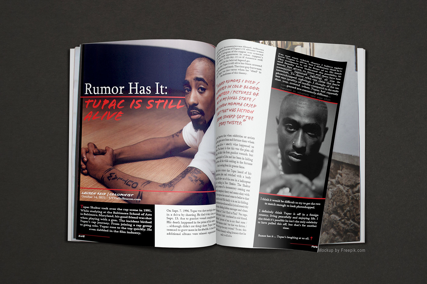
This magazine spread project was created as part of a typography study. An artist was chosen to be the subject of a featured article in a publication design and typographic portrait, along with a font chosen to visually represent the artist.
A typeface called Flood STD was chosen in alignment with the legendary artist, Tupac Shakur.

The Flood STD typeface was chosen because it supports and relays the essence of Tupac's personality. The sans-serif styling gives this typeface a modern feel, perfect for the 90’s era that Tupac emerged from. Its display-like styling gives this typeface a bold, eye-catching appearance and demands attention with its textured strokes and gritty execution – all notable in representing Tupac’s demeanor.
With this typeface relaying a handwritten styling as well, a raw, personal, authentic mood is drawn from it that communicates familiarity and intrigue. Tupac’s essence and unapologetic nature attracted and resonated with people all over the world, and the handwritten font characteristics display that mood.
The typeface selection was inspired by Tupac's handwriting, seen below in an original poem that he wrote ...

For the magazine spread, the typefaces Flood STD and Sylfaen Regular were used. Flood STD is used sparingly, but enough to establish a hierarchy that relays the street mood of the typeface. It is used to emphasize the subject of the headline, and the pull quote of Tupac’s lyrics mentioned within the article. The page numbers at the bottom corners of the pages are reflected in Flood STD as well, keeping a cohesiveness among the whole project.


Pairing with this, the transitional serif font, Sylfaen, was chosen for contrast, but which also supports the vibe of the content. It is a foundational typeface created in the 90’s that communicates a sophisticated feel, but with an old school uniqueness that is memorable and intriguing.
The two typefaces together capture the attention of the audience with an urban, bold relatability and timeless, authoritative maturity – all of which support Tupac’s essence and the mood of the spread.
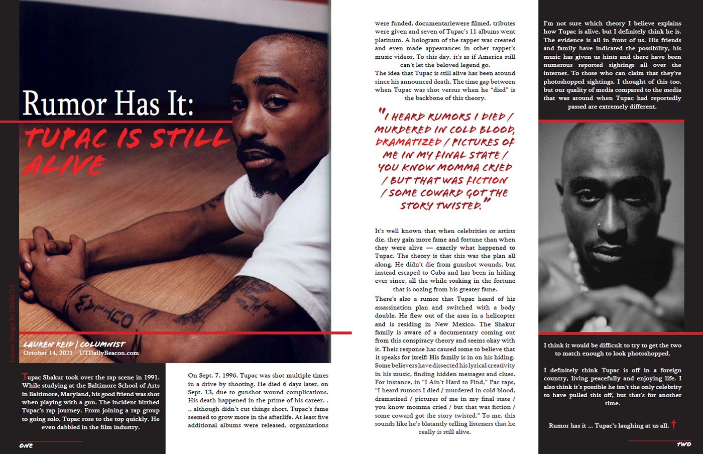
Visual hierarchy was used in the use of images and color, which together draw the viewer’s eye throughout the layout in a way that entices them to want to soak in the information. Grids and guidelines were used in creating the layout to ensure proximity of all the design elements remained balanced and organized. All text was justified in ways that complimented the layout, and the body copy was adjusted for leading.
Thank you for checkin' out my work!
Drop me a COMMENT thoughts are welcomed
Please APPRECIATE if you would like to see more
Feel free to FOLLOW to support future projects
Drop me a COMMENT thoughts are welcomed
Please APPRECIATE if you would like to see more
Feel free to FOLLOW to support future projects
Graphic Designs © Jacqueline 'Jae' Bello
All images and mockups used obtained from free use, public domain websites, and all raw design files contain appropriate copyright information.
All images and mockups used obtained from free use, public domain websites, and all raw design files contain appropriate copyright information.


